NYC Parks
Dive into this UX research case study of the NYC Parks mobile app, highlighting my skills in user
research, design insights, and functionality development.
Discover how I contributed as a UX
researcher, shaping an website for park enthusiasts to easily explore over 1,700 parks and
recreational facilities across New York City.
Project Type:
UX Research
Information Architecture
Role:
UX Researcher
Project Time:
2 weeks
Project Members:
Aliyana - UX Designer
Lola - UI Designer
Project Background
NYC Parks is in charge of more than 30,000 acres of land, which is about 14% of New York City.
This includes more than 5,000 different properties, such as Coney Island Beach, Central Park,
community gardens, and Greenstreets. nycgovparks.org is designed to show information about parks in
and around New York, including park history, activities, park events, opportunities to get involved,
and other services.
Heuristic Reviews
As part of our UX research process, we conducted a heuristic review of the NYC Parks mobile app to identify potential usability issues and areas for improvement. Using the Jeff Rubin Severity Scale, we evaluated each issue based on its severity and likelihood to impact the user experience.
Severity Scale
- 4: Unusable: The user is not able to or will not want to use a particular part of the product because of the way that the product has been designed and implemented.
- 3: Severe: The user will probably use or attempt to use the product here, but will be severely limited in his or her ability to do so.
- 2: Moderate: The user will be able to use the product in most cases, but will have to undertake some moderate effort in getting around the problem.
- 1: Irritant: The problem occurs only intermittently, can be circumvented easily, or is dependent on a standard that is outside the product’s boundaries. Could also be a cosmetic problem.
Heuristic Problem Findings
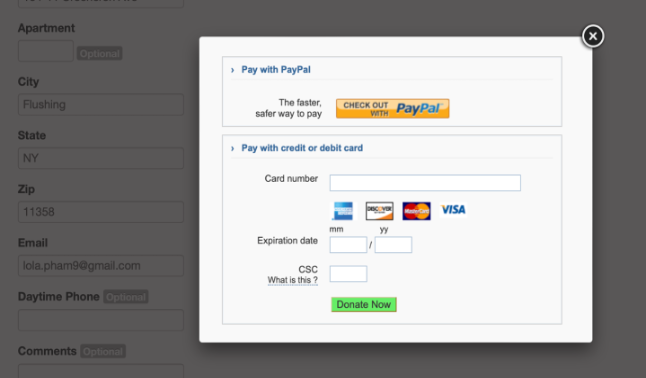
Irritant: Users will have to repeat steps if they want to change something before that
Description
Unable to change amount of donation after entering payment details.
Users will have to reenter the details if they would like to edit the amount.
Related Heuristic
Recommendation
Allow users to edit amount when they review the payment
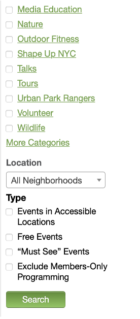
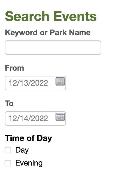
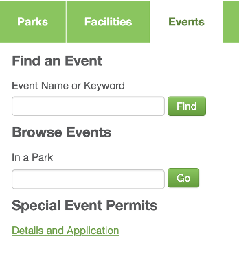
Moderate: Search button is hard to find
Description
In the park event filter section, the search button is at
the bottom of a long list of filters.
Users will have to scroll all the way down to find.
Related Heuristic
Recommendation
Have the search button at the top or where it could be easier
to find.
Or make the filter section collapsible.
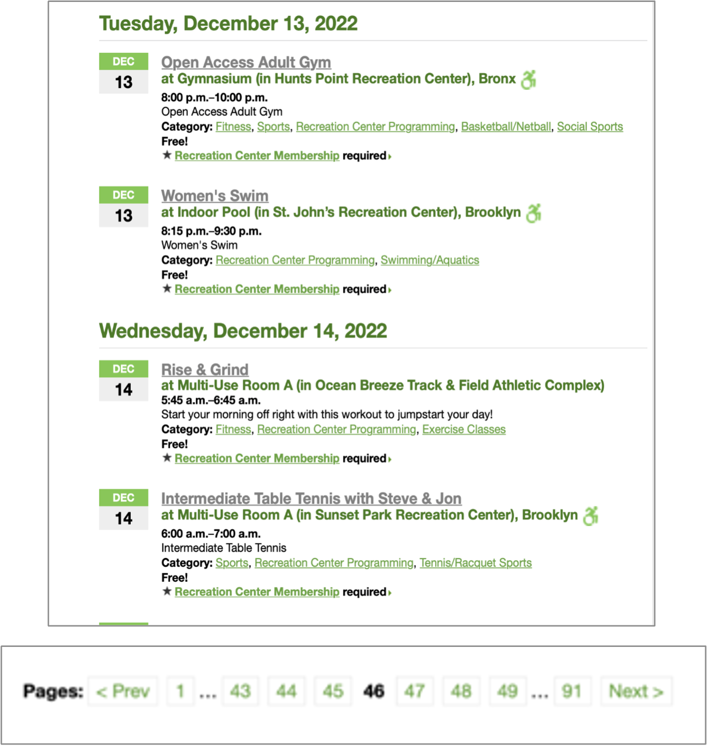
Severe: Difficult to find events by dates
Description
When searching for events in a day range, users must scroll past the first date to reach the second.
Related Heuristic
Recommendation
Have tabs for each day (within the day range selected) so users can quickly view the events for that day.
Moderate: search button is hard to find
Description
There`s no option for users to view park events by miles radius from a zip code of their choice. This might cause users more time to search for events.
Related Heuristic
Recommendation
Allow users to enter zip code and set miles radius to filter park events
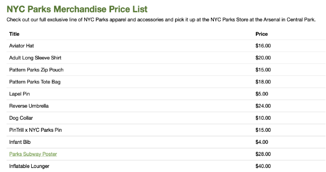
Severe: no product photos
Description
There are no photos for the items listed in the shop. Users won’t know what the products look like.
Related Heuristic
Recommendation
Provide images for each items listed
Conducting the Test
Goal
By conducting the usability test, we hope to enhance the website's usability and make it more effective and user-friendly.
Research Questions
- How do users look for park events and register?
- How do users make a donation?
- How are users able to purchase brand merchandise?
Participants
The main traits of the participants should be those of nature lovers who enjoy spending time outside in parks and public areas. All age groups visit the parks, so we can choose the 18–45 age range as the best fit for the study. Total Number of Participants: 6
Methodology
- Six people from different groups and backgrounds took part in a moderated usability test.
- Each participant will have a 30-minute session that includes a short introduction, an interview, a task on nycgovparks.org, and a debriefing.
- The tasks are to look for park events and register, make donations and purchase merchandise.
Test Plan Introductory Questions
- We’ll first start with your name, age, and where you live at the moment, including your occupation.
- What experience do you have with New York City parks? How often would you say you go to parks in the city?
- Have you ever accessed the https://www.nycgovparks.org/ website before? Do you know what it looks like?

Tasks as Part of Test Plan
-
Task 1
You are interested in attending an event at a New York City park and would like to inquire about event details in order to decide what event will most suit your needs. Please show me how you would go about doing that on the website.
-
Task 2
You are an avid park-goer and would like to donate $35 to nycgovparks. Please go ahead and attempt to do that, up until the payment details page.
-
Task 3
You want to look at park merchandise and are thinking about buying something. Please show me how you would go about doing that.
Follow-Up Questions
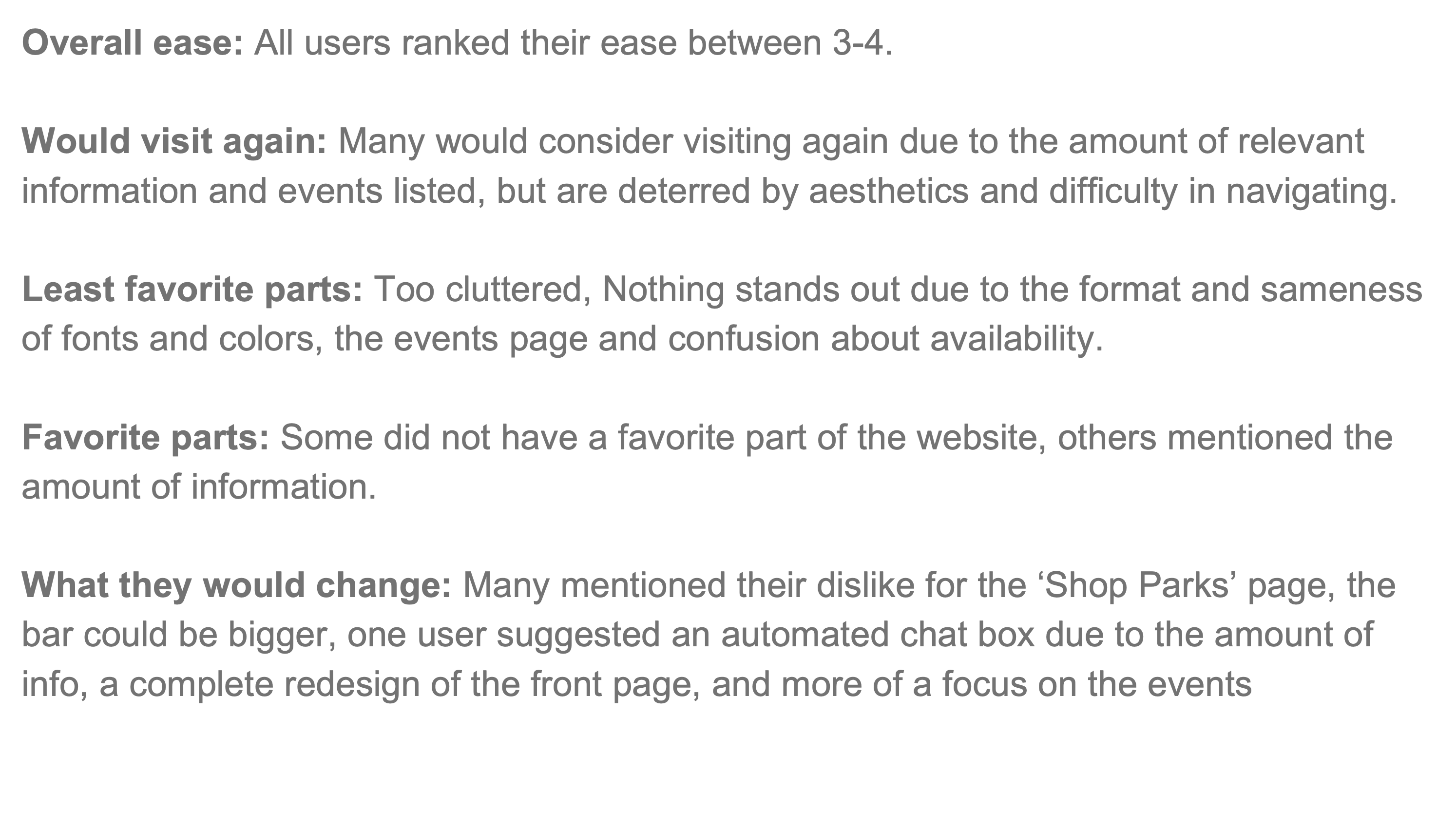
- How would you describe the ease of which you navigated the website?
- In the future, if you were interested in looking for park information, would you consider accessing this website?
- What was your favorite part of the website, if you have one?
- What was your least favorite part of the website? What would you change about it?
- Do you have any additional comments you would like to add?
Data Report
Introductory answers

Participants success rate for Tasks, 1 - success, 0 - failure

Participants Tasks completion time (secs)

Participants ease ratings for Tasks, 1 - very difficult, 5 - very easy

Recommendations
Task 1
- More pictures would break up the monotony of the list format
- Events should be immediately excluded upon finishing
- Users should be able to choose what area of the city you are interested in
- Emphasis on what’s best for kids is a good feature that should be implemented for different age groups
.png)
Task 2
- More pictures would break up the monotony of the list format
- Events should be immediately excluded upon finishing
.png)
Task 3
- Use a different term for “Shop Parks” so it's less confusing
- Events should be immediately excluded upon finishing
- Should make it clear that visitors can only purchase merchandise at the parks (not online)
- Should include images and description of the items
- Only 5 images of randomly selected merch and is not in gallery mode
- Only the map product is linked to another page- creates some confusion about what is available and what is not.
- Confusing to navigate as it is in the same list format that is implemented throughout the website
.png)
Final thoughts
Post test summary
Key Findings